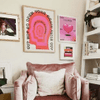
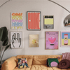
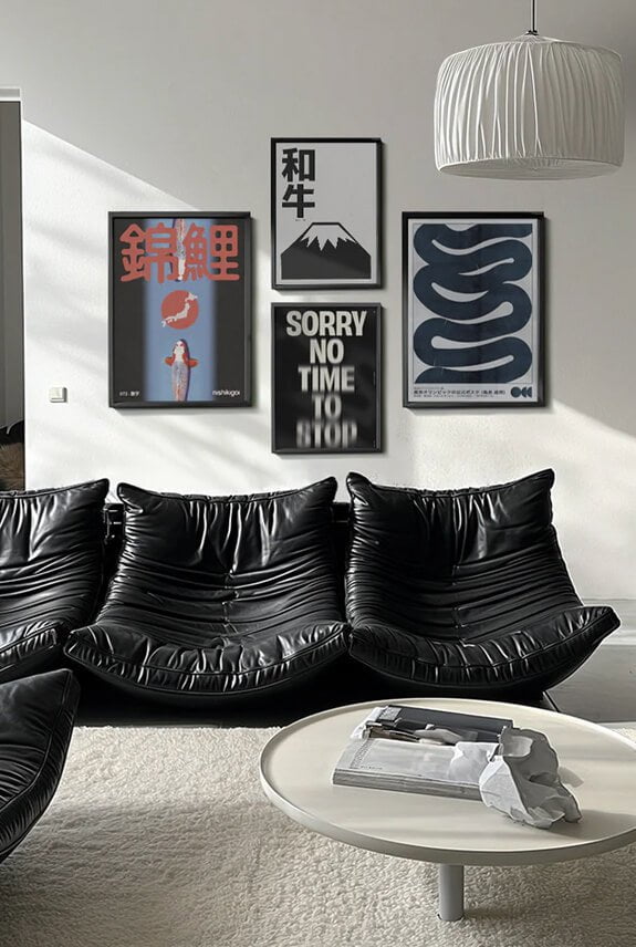
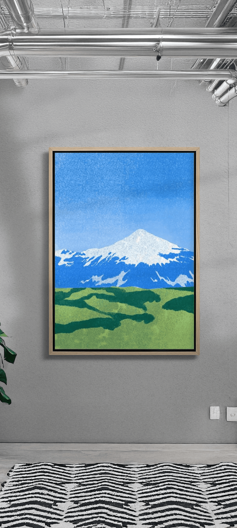
Before the COVID-19 pandemic took hold in 2020, the minimalist movement was having yet another moment in the sun. But when millions of people started finding themselves stuck in their homes, the prospect of long-time confinement in a clean but sparse environment led to a shift in perspectives, swinging the style pendulum in favour of maximalism.
Maximalism is a great choice if you love to constantly decorate or crave a completely personalised home. However, while the abundance of elements allows for creativity, it's important to approach the design thoughtfully to avoid potential disorganisation. For instance, incorporating a graphic design poster or other cool art prints is a decorating approach that will require careful curation to ensure that each addition elevates the overall aesthetic rather than appearing cluttered or unsightly.
It’s possible to include elements like unique art prints and contemporary art posters into a maximalist space, but it does require a bit more curating and forethought than you might expect. Here are some tips that will help you organically display contemporary art prints and other wall art within your maximalist home:
1) Stick to an Interesting But Relatively Tight Colour Palette

The main reason the maximalist homes on Pinterest and interior design magazines don’t look too overwrought is that they all adhere to a colour palette. The palette you decide on for a room should not only influence the interior’s colours and furniture but also the illustration art posters and other objects that you choose to inhabit the space. You don’t have to be overly strict with the colours of the art pieces that make the cut, but you should be aware of when a piece is clashing with the other elements or veering away from your original palette.
2) Choose Art Pieces with Interesting Textures

Experimenting with textures is a big part of putting together an interesting and coherent maximalist home. Paintings with strong impasto elements that showcase obvious brush and palette marks are a popular addition to maximalist homes for that reason. However, there are other ways to inject interesting textures onto your wall art.
For instance, you can dramatically change the look and texture of illustration art prints by displaying them behind acrylic panels, creating depth as well as a subtle interplay of light. Likewise, you can display a piece without a cover for a more simple and immediate look. You can also try out different frame styles and designs to draw more interest to a piece or make it blend more into your maximalist home.
3) Play with Patterns

One of the things that people love (and hate) about maximalism is that it gives decorators free rein to mix and match patterns in combinations that are sometimes frowned upon. In well-designed maximalist homes, naturalistic patterns like floral designs and animal prints will often sit in harmony with geometric motifs like stripes and hard blocks of colour.
Following this cue, it’s good to be aware of the patterns and overall look your posters and prints bring to a space. From there, you can make a more strategic decision on how to display them, depending on whether you want your pieces to stand out or reinforce certain patterns and motifs already present in the space.
4) Illuminate Your Art with Complementary Lighting

Lighting is an often-overlooked aspect of interior design and it’s especially crucial for maximalist spaces. Good lighting can help “glue” all the different elements of a space together, reinforcing the mood and look that you set with your chosen colour palettes, patterns, and textures. Importantly, your art prints also need good lighting to appear their best.
In your maximalist home, a combination of floor lamps, overhead lights, table lights, and even fairy lights can be used to create a depth of lighting that elevates both your space and art prints. You can also experiment with different light temperatures to fine-tune the look and mood of your displays. Lastly, you can try selectively lighting up different zones of a room to highlight artworks or other interesting objects within the space.
5) Choose Pieces with the Right Size and Scale

When positioning a new piece, it helps to pay attention to how different elements in the room are sized. This will help you build a balanced composition that enhances the visual diversity of the space without devolving into chaos. As a rule of thumb, a small piece may get lost on a large wall, while an overly large piece can overwhelm a smaller space.
If you want a smaller piece to stand out rather than blend in, you do have several options. Experiment with the positioning of other decorative elements within your space so that they don’t compete for attention with the piece you want to highlight. You can also, as discussed earlier, use colour, texture, patterns, and lighting to draw more attention to a given piece.
Balancing Restraint and Expression
The recent popularity of maximalism likely reflects a collective desire for warmth, personality, and individuality in a seemingly impersonal world. As appealing as the trend is, it does require intent and considerable restraint to avoid visual clutter. If you want to add contemporary art prints and illustrations to a maximalist home, it’s important to curate pieces judiciously, keeping stock of key maximalist principles to harmoniously showcase your art, living spaces, and personality.


