Typography art prints have become a go-to home decorating choice for individuals aiming to strike an effortless balance between aesthetics and personal expression. If you’re the sort of person who wants your home to echo your unique personality from every corner, then chances are generic or traditional art pieces won’t cut it. Think of how a bold statement piece can command attention as soon as you walk into a room, or how a subtle script can be the cherry on top of a minimalist space. Whatever style you choose, you can be sure that good typography prints will turn your bare walls into meaningful focal points.
At DROOL, we’re big believers in the power of typography as a form of self-expression. As a leading provider of contemporary art prints, we curate an extensive selection of high-quality pieces by emerging artists. Our aim is to make unique artwork accessible to everyone, and we’re confident that our catalogue contains something to match every taste. Whether you prefer sleek modern typefaces or expressive, hand-drawn lettering, you can rest assured that any and all prints you invest in will be produced to the highest standard of craftsmanship.
If you’re looking to incorporate typography prints into your home in a way that enhances rather than overwhelms your space, the following tips will help you make thoughtful and stylish choices:
Choose a Theme That Reflects Your Style

The typography you choose should feel like an extension of your personality and enhance the atmosphere you want to create. A sleek sans-serif design in monochrome may suit a minimalist aesthetic, while vintage-inspired typefaces can bring warmth to a cosy, eclectic space. If your decor leans industrial, bold, block-letter prints can add to the raw, urban feel. Selecting typography that resonates with your taste is the best way to put together a space that feels cohesive and curated.
Unsure where to start? Peep DROOL’s best sellers to see what art lovers all over the world are diggin’ at the moment. You’ll find modern and abstract compositions right alongside classic serif designs—all carefully curated so you have only the best typography prints to choose from as you search for the perfect match for your home.
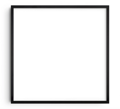
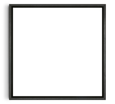
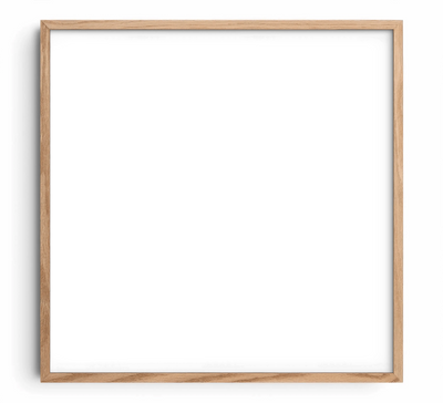
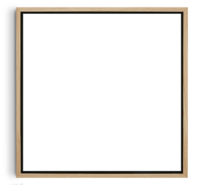
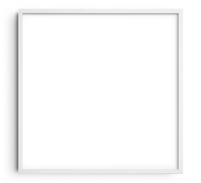
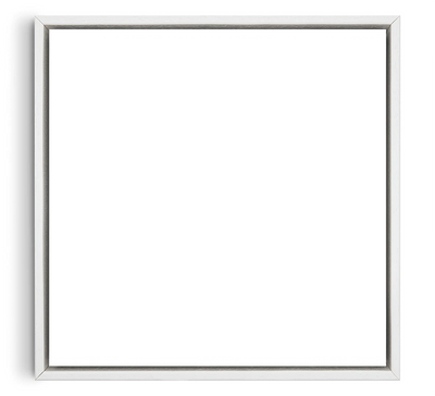
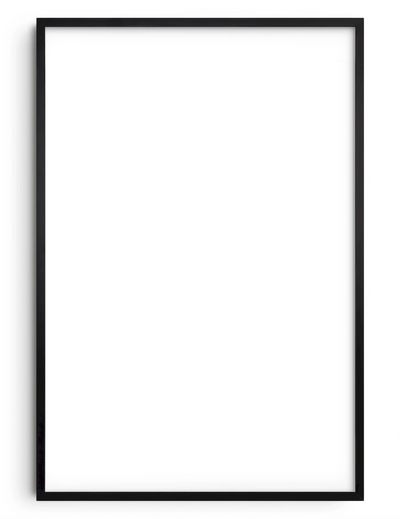
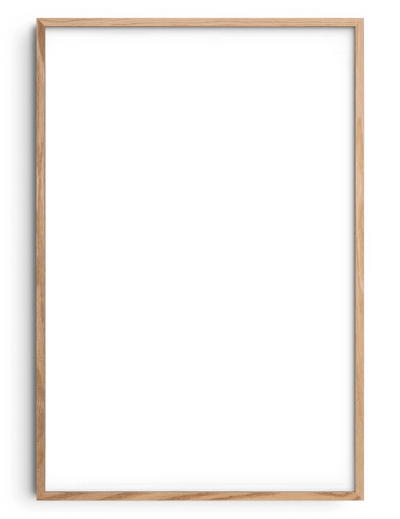
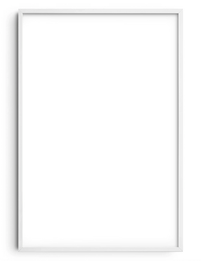
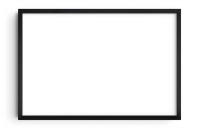
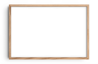
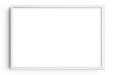
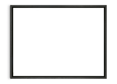
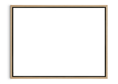
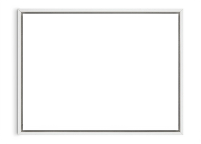
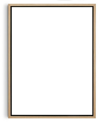
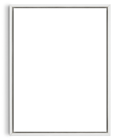
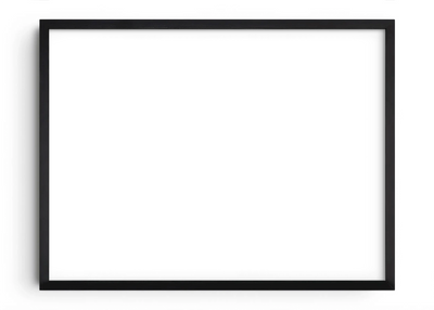
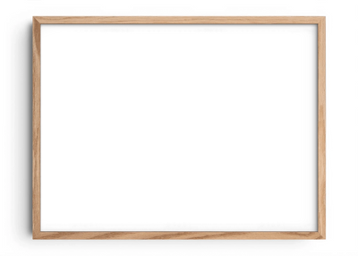
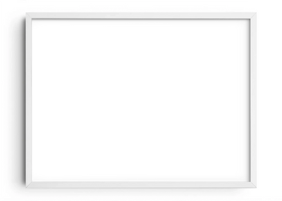
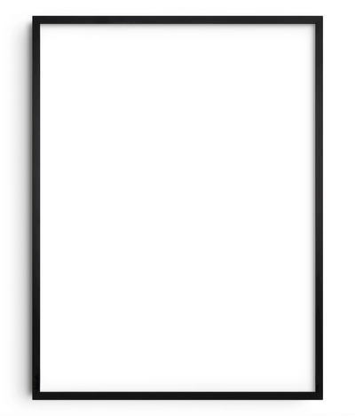
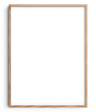
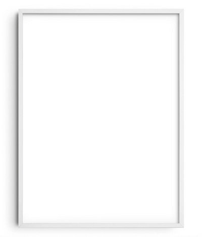
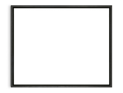
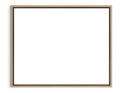
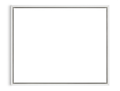
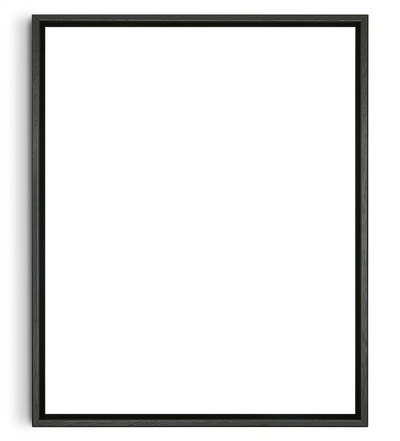
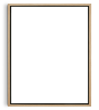
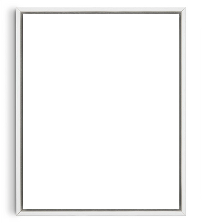
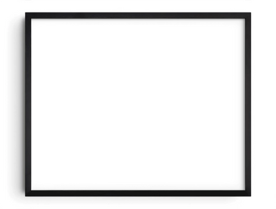
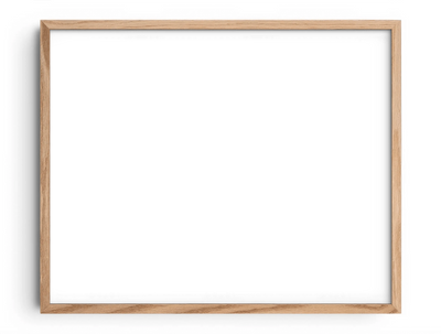
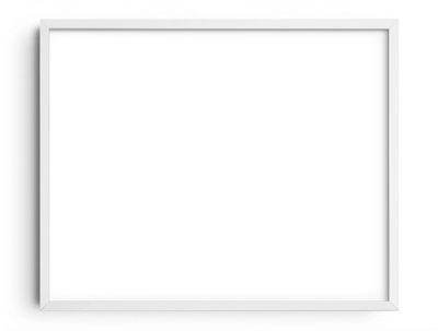
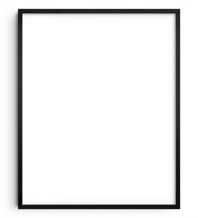
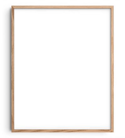
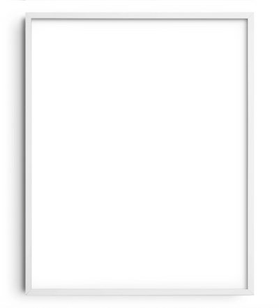
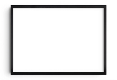
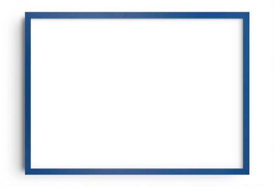
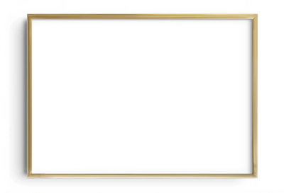
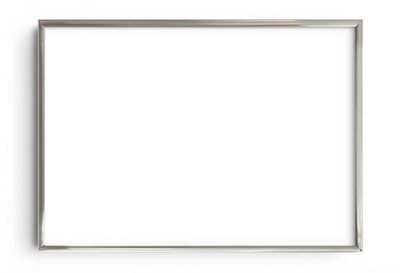
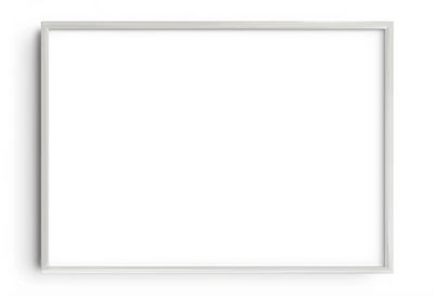
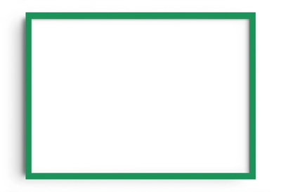
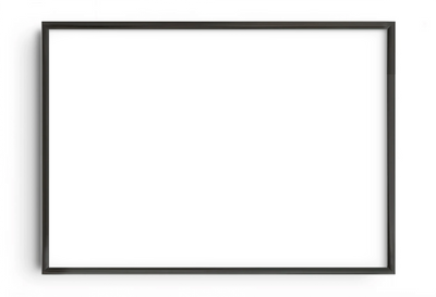
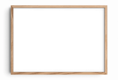
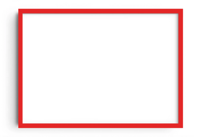
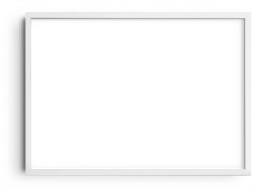
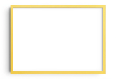
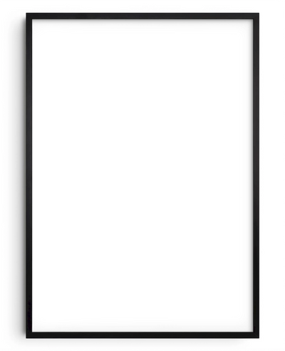
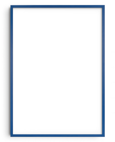
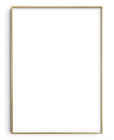
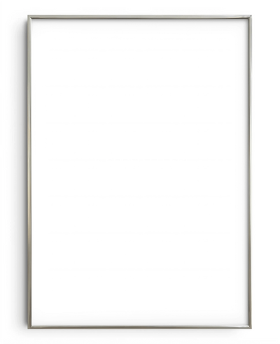
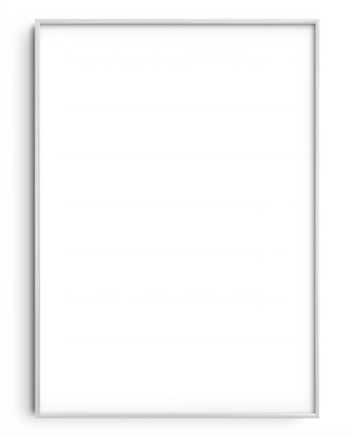
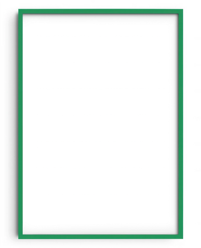
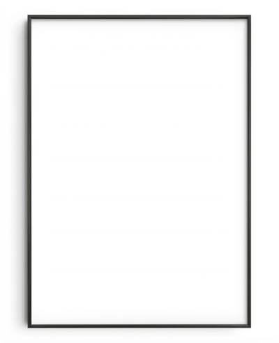
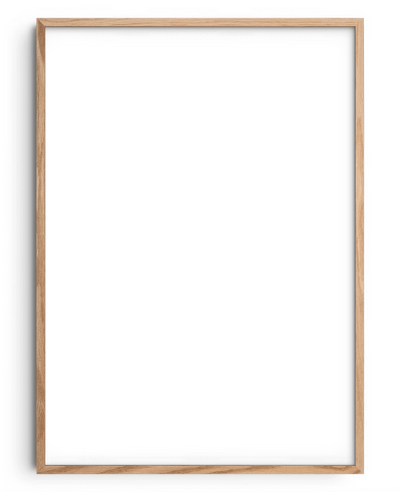
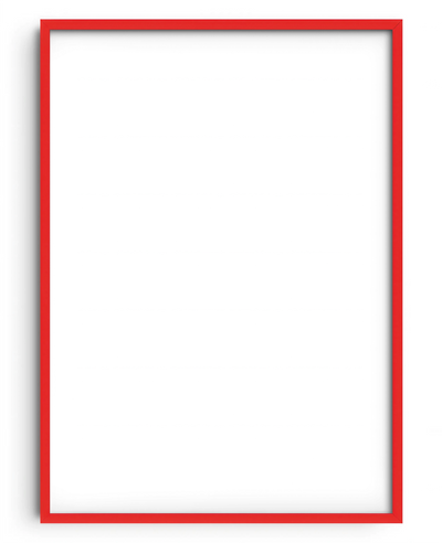
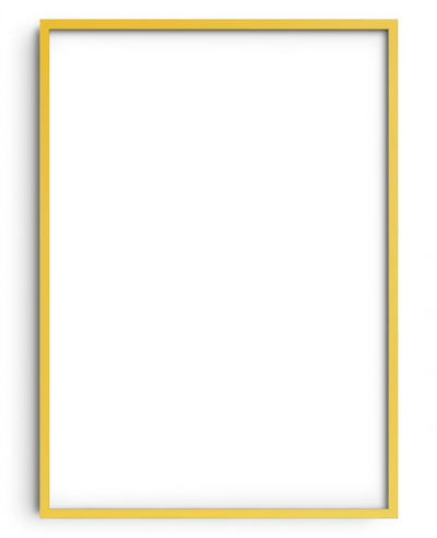
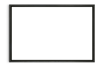
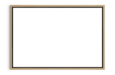
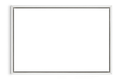
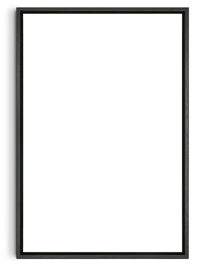
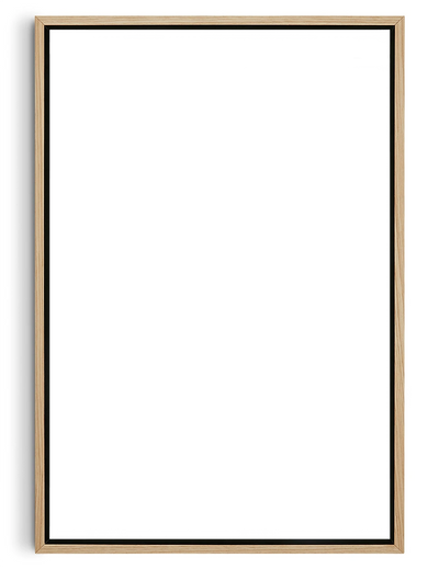
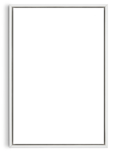
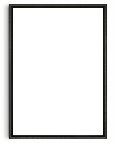
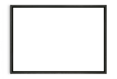
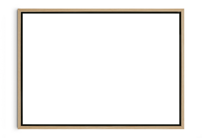
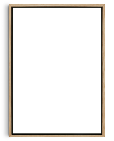
Frame Your Prints Strategically

A frame does more than protect your artwork—it enhances its visual impact and ties it into your overall decor. A clean, black frame can make bold typography pop, while warm wooden frames soften the look of structured lettering. Floating frames, on the other hand, can feel airier and more contemporary, perfect for minimalist interiors.
DROOL provides custom framing options designed to fit your print perfectly; just choose a colour that suits your space to a tee and we’ll do the rest. All our frames are handmade and sustainably sourced, using woods certified by the Forest Stewardship Council (FSC), so you can feel good about displaying them in your home and confident that they’ll last you for years to come.
Mix Typography with Other Art Forms

Typography prints don’t have to stand alone—pairing them with photography, abstract art, or graphic illustrations can create a dynamic and visually engaging display. When mixing typography with other prints, aim for a balance in composition. You might offset a bold, typographic statement piece with softer, abstract designs to prevent visual clutter. You can even try creating a gallery wall that combines different art styles for more texture and contrast; you’ll end up with a space that feels multifaceted rather than rigidly themed.
Play with Size and Placement

Typography prints come in different sizes, each of which will have a different effect when you hang it up in your living areas. The key is to consider scale in relation to the space. A large-format print can anchor a room when placed above a sofa or bed, whereas smaller pieces work well when grouped together in a structured arrangement.
Placement is just as important as size. Instead of defaulting to eye-level positioning, consider leaning prints against walls on shelves or consoles for a more relaxed, lived-in feel. Experimenting with unconventional placements—such as layering prints over one another or staggering them across different heights—can give your display more personality.
Experiment with Colour and Contrast

You have all the freedom in the world to think beyond classic black and white for typography—and in fact, colour can be a powerful design tool that influences the mood of a space. Want to inject some energy into a neutral room? A pop of bright red or deep emerald green can do the trick. Looking for a calmer, more visually cohesive space? Muted earth tones are the way to go. The key is to choose colours that harmonise well with your existing palette while making an impact.
Contrast is equally important. High-contrast prints—such as white text on a dark background—draw the eye and create a striking focal point. Softer contrasts, like pastel lettering on a neutral canvas, blend more seamlessly into their surroundings, so they’re ideal if you want an aesthetic that’s more elegant and understated.
Typography prints can transform any living area when thoughtfully incorporated. They have a lot to say—quite literally—about the personality and passions of the space’s occupant, so don’t hesitate to use them to build a space that’s uniquely yours. We at DROOL are more than ready to provide you with high-quality typography prints that align with your vision for your home, so don’t hesitate to explore or catalogue and get in touch with us.alex