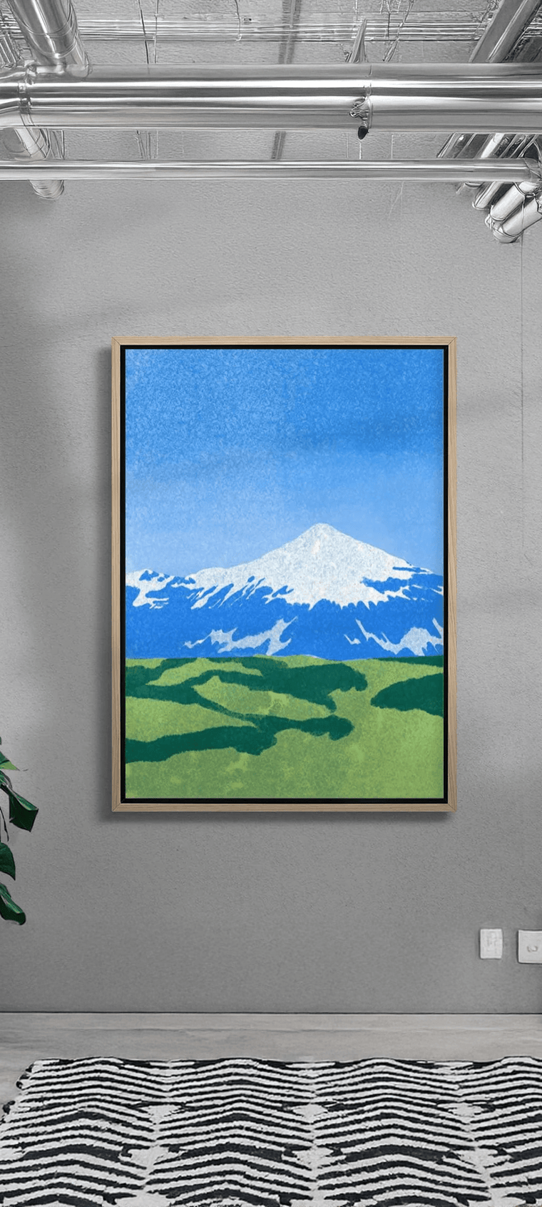
Minimalist interior design has experienced something of a revival in recent years, and it’s no surprise that typography art—a movement that emerged and co-existed with minimalism—has received a lot of recent interest as well. Drawing heavily from the world of fonts, letterforms, and layout design, typography art has a distinctive and literal visual language that sets it apart from other art genres.
Despite the apparent simplicity of most pieces in this style, many classic and cutting-edge typography art pieces, like typography-driven graphic design posters, feature masterful technical execution and offer multiple layers of meaning that go beyond their literal messaging. Here’s a feature on typography art, as well as some tips on using typography-inspired contemporary art prints and graphic design prints from a reputable art platform like DROOL to spruce up your living spaces.
Featuring Typography Art in Your Home Spaces
Both contemporary art posters and reproductions of classic typography art prints have consistently been sought after by interior designers and homeowners, all thanks to their timelessness, boldness, and ease of integration within a variety of spaces. However, the pedestrian nature of typography also means that pieces can blend a bit too easily in the background.
To that end, here are some ideas that will help you put your treasured typography art pieces front and centre in your home:
1) Use Typography Art’s Strong Looks and Colours to Your Advantage

Typographic art pieces often feature strategic blocking, colour, and heaps of contrast to draw the eye and enhance the overall message of the artwork. As such, they can effortlessly contrast with other pieces and draw attention to themselves in a variety of living settings.
Even so, typography art pieces tend to work well in rooms with subdued walls and decor. If a display area is already a bit too busy, a typography art piece can lose just a bit of its impact, especially if it does not have a lot of negative space to begin with. This isn’t necessarily a problem in every situation, but it’s worth remembering regardless.
To bring a typographic art piece to the forefront, take note of the specific elements that jump out, and then build out your display from there. Once you’ve singled out what it is that makes a piece special, contrasting or harmonising it and other adjacent art pieces with the room’s vibe and colour palette will be much easier for you.
2) Contrast with Pieces from Other Art Movements

In addition to their bold forms, typography art pieces usually also have a social commentary or some humour underpinning them. Take note that these messages can get diluted if your pieces are in a room with several other typography-based pieces.
To get around this, consider displaying a key typography art piece with works from other movements to provide visual contrast and achieve an interplay of messages. This mix-and-match approach may not be everyone’s cup of tea, but it does allow both your typography art piece and other artworks to play off of each other within a shared space. In this way, you may be able to bring attention not just to your favourite typography artwork, but also other artworks you may have in your home.
3) Be Intentional with Your Furniture Choices

It can be easy to forget this, but typography art does not exist in a vacuum. Typefaces and colour palettes are invariably tied to specific movements or eras, with each of these having their own design vernaculars. Historically, these different vernaculars have also informed the themes and overall look of other art forms and objects, including furniture.
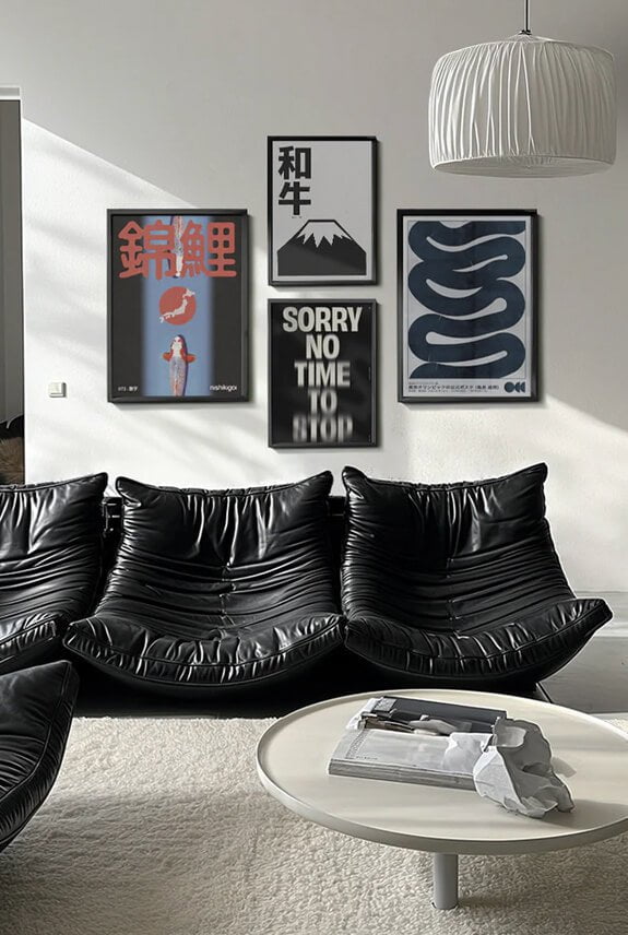
For a more coherent display area, you can choose chairs, side tables, rugs, and other furniture pieces with styles that coincide with the era or style movement of your typographic wall art. Typography-inspired furniture does exist, and you can further reinforce the typography theme with at least one key piece.
If you’re not a fan of letter-shaped furniture, no worries. Most typography art pieces go exceptionally well with mid-century modern and minimalist-inspired furniture, giving you plenty of easily available options for outfitting your living space.
On the flip side, if you don’t feel like buying new furniture, you can also use printed throw pillows, letter-shaped sculptures, or even colourful stacks of books and magazines to provide your typography art pieces with the three-dimensional counterpoints they need.
Appreciating the Nuances of Typography Art
Despite typography art’s seemingly simplistic focus on text and form, the style is, nonetheless, capable of delivering a range of complex and often contradictory ideas. Though the style is often criticised for being plain or naive, typography art pieces can actually convey immense depth, offering not just insight in the words but also artistic prowess and glimpses into the history and the contexts that define various letterforms.
And in keeping with the print medium’s democratic roots, typography art is meant to be enjoyed however you see fit. Great pieces can stand on their own, without the need for over-analysis or another critic’s validation. If you like what a piece says or how it looks on your wall, then that’s all that really matters. Knowing this, don’t hesitate to be broad in your search for the perfect typography art pieces from DROOL.


