Picture this: you’ve finally found the perfect sofa, but now you’re second-guessing that coral print or mustard-toned rug. Will it all clash or come together?
It can seem daunting at first to mix contrasting colours, especially when you’re aiming for a space that looks intentional and not accidental. But bold combinations don’t have to be risky. With the right approach, they can bring energy, character, and unexpected harmony to a room.
At DROOL Art, we’re all about turning visual friction into something that feels thoughtfully designed. Our collection of unique contemporary art posters makes it easy to explore contrast with confidence. From curated edits to clever framing solutions, we offer tools that help you embrace expressive design without the guesswork.
If you’re looking for ideas to pair opposing shades with purpose, this article is for you. Let’s explore some straightforward, inspiring ways to embrace contrast and bring your space to life:
1) Use Art as a Colour Collision Catalyst

When it comes to clashing colours with confidence, your walls are a great place to begin. Art prints allow you to test bold pairings without the long-term commitment of painted surfaces or a major furniture overhaul. Try combinations like magenta with chartreuse or deep blue beside rust. These vibrant contrasts have the power to transform a room’s atmosphere almost immediately.
Not sure where to start? Explore DROOL’s Founder Edit, a curated selection of our founder’s unapologetic picks that lean into visual tension and expressive flair. These pieces are ideal for setting the tone. Choose one standout work, then echo its clashing hues through textiles, ceramics, or upholstery to pull the room together.
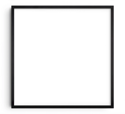
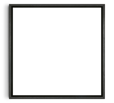
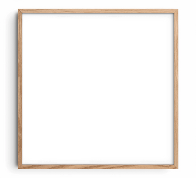
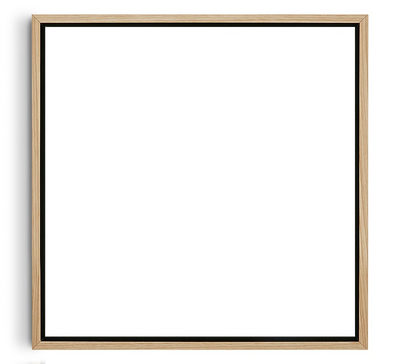
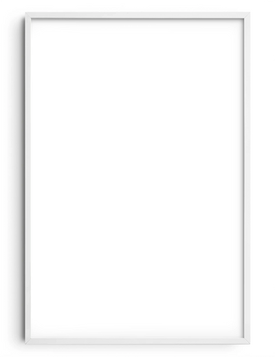
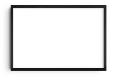
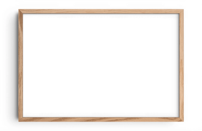
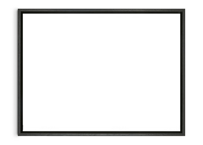
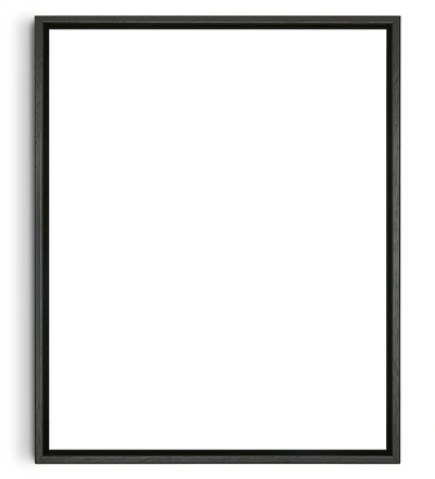
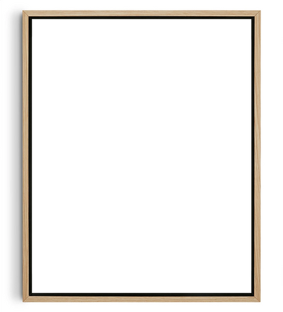
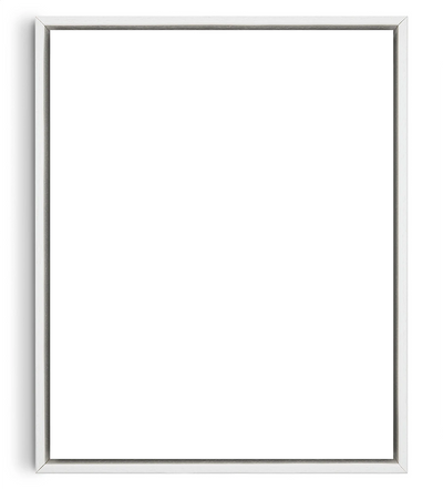
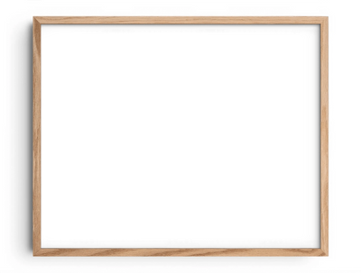
If you enjoy refreshing your space regularly, our GlowFrame and wooden frames make it easy to swap out prints as your style evolves. The ideal framing solution will provide a low-commitment way to explore high-impact contrast, no paintbrush required.
2) Start with a Dominant Hue and Build Around It

Vibrant, high-contrast interiors work best when there’s a clear centre of gravity. Selecting one dominant hue, like forest green, burnt orange, or deep navy, will give your colour palette structure and intent. With that anchor in place, bolder accents will feel deliberate rather than chaotic.
One way to ground your space is by starting with a hero piece. This could be a large rug, a feature wall, or even better, one of DROOL’s muted prints. These artworks offer rich character without overwhelming the room, making them ideal foundations for layered, expressive palettes. Look for a piece that resonates with your style and let its core colour guide the rest of the scheme.
From there, build contrast thoughtfully. Introduce complementary cushions or a striking lampshade, then experiment with unexpected touches like painted trim or graphic wall decals in more daring shades. You’ll find the room takes shape naturally around your chosen hue, creating a space that feels cohesive and entirely your own.
3) Balance Warm and Cool Tones for Intentional Contrast

Some of the most compelling interiors are built on temperature contrasts. Rather than matching by brightness or saturation, try mixing warm and cool shades with purpose to bring movement into the space, like a conversation between opposing ideas. Think blush pink paired with steel blue, or ochre offset by sage. These combinations create a visual tension that feels dynamic, not disjointed.
To guide your choices, consider how colours behave. Warm tones such as reds, oranges, yellows, and terra cottas add energy and pull elements forward. Cool shades like blues, greys, and soft greens recede and calm. Used together, they create a sense of rhythm that enlivens a room.
One way to introduce this type of contrast is by adding a single feature that shifts the room’s temperature. In a cooler-toned space, for instance, a warm-hued artwork or textile can act as a focal point without overpowering the scheme. Remember, it’s not about achieving symmetry, but about creating balance that feels expressive and cohesive.
4) Layer with Neutrals to Give Colours Room to Breathe

When working with clashing colours, breathing room is essential, as the vibrancy can quickly feel overwhelming. This is where neutrals like warm whites, soft greys, muted taupes, and gentle creams come in. They offer space for the eye to rest and help prevent a room from appearing too chaotic. By acting as quiet anchors, they allow bolder elements to stand out with greater clarity.
Start with the foundational pieces in your space. Neutral tones on walls, large furniture, or flooring can create a calm, open backdrop for more expressive details. Rather than dulling your aesthetic, this kind of restraint lets your style take centre stage. You might also consider incorporating artwork from DROOL’s Neutral collection, which will add texture and dimension without overwhelming the colour scheme.
To pull everything together, echo these soft tones through smaller details. A ceramic vase, a natural-fibre rug, a woven basket, or a linen throw in a similar shade can create cohesion and reinforce contrast through calm.
5) Repeat and Echo Colours for Cohesion

Contrasting hues work best when they feel connected across the room. Instead of leaving bold tones isolated, repeat them in smaller, well-placed accents. This creates a visual rhythm that guides the eye and makes even bold palettes feel connected.
You might pull a pop of cobalt from an artwork and reintroduce it through a cushion or lampshade. A splash of crimson spotted in a poster could be echoed in a nearby ceramic vase or book spine. These callbacks may seem subtle, but they’re powerful in unifying your design.
Framing and placement can also support this sense of flow. Try clustering prints with complementary palettes or positioning them near furniture or objects that reflect their tones. When colours are echoed thoughtfully, even the boldest combinations feel harmonious.
Clashing colours aren’t something to avoid; they’re an opportunity to explore. With a little structure and creativity, even the boldest pairings can bring character to your space and reflect your personality with confidence.
Ready to experiment? Browse DROOL’s collection of art prints for inspiration, or take our Art Finder Quiz to discover pieces that match your style, space, and colour instincts perfectly.